Orientation App Design Challenge
In January 2019, I had 5 days to perform a quick design challenge on one feature of an app for a university's orientation.
Exercise Prompt
A new school year is approaching and the orientation team is looking to you for some design expertise.
Design an experience for students to discover orientation events and craft a visual system to accommodate different types of events: sports, music, visual arts, social groups, and volunteering events. Provide high-fidelity mocks for searching, browsing, and viewing the details for these different events.
My Plan
MAIN GOAL: for a user to be able to efficiently and easily browse, search, and see details for events at orientation
Important Factors
-
create a calendar aspect
-
create an effective way to filter through events
Other Info to Consider:
-
this app (or this part of an app) is only to be used very short term
-
creating just the events section of a larger, potential orientation application
Competitive Analysis
I started by looking at Georgia Tech’s and other school’s orientation experiences with the Guidebook app, the Georgia Tech organizations page, and Google Calendar. I focused on how each performed at the search, filters, and more information aspects.
Guidebook app

Georgia Tech Org App

Google Calendar


User Journey for Finding an Event
Attend Event
Search/Browse
Type a keyword or look through events to find what you are looking for.
Filter Results
Add filters to narrow down or show events that qualify.
View Details
Once you find an event, you can view more details about the event. An important step that can sway a user’s mind to attend or not
If you are interested in the event and it meets requirements, you can add it your calendar, set a reminder, and/or visit that organization’s social media
OR
Do Not Attend
If you do not want to attend the event, you can return to results or restart your search. Why users not want to attend? Not interested or something else?
Interviews & Surveys
Through 15 student responses from a Google Form and in-person interviews, I got some insight about the important information regarding orientation, event details, and how information is communicated.
Survey Questions:
Some of the main questions and responses were:
1
2
3
4
5
List the most significant pieces of information for any campus event or any type of event that you want to attend?
List the most significant pieces of information about an organization that you want to learn more about?
How did you keep track of what events you wanted to attend at FASET (Georgia Tech’s Orientation)?
Were there any frustrations you had with technology, communication, or spaces during FASET?
If there were FASET events that you intended to attend but did not, list the reasons why you did not go.
-
Location, time, what, location, contact info, type of event, date
-
Communication (9 votes), spaces (2)
-
Campus presence, what they do, contact info, quotes, time commitment, ways to get involved, calendar of events, where they meet, club leade
-
Word of mouth (8 votes), technology (2), pamphlet (2)
-
Couldn’t find enough info (9 votes), hard to find (2)
Gathered Knowledge
General Info
The most important info to list for:
-
Events: time & place
-
Organizations: summary, contact info, and calendar of events
Communication
There’s a need for a new form of communication to get updated info to users
Calendar
There needs to be a simple, direct calendar of the user’s events and upcoming events to effectively view events
Purpose of Experience
Different survey takers had responses based off different experiences during orientation. Some users want to view an event to attend and some want to just learn more information for later.
User Paradigms
The Parent
-
Wants to know more information from events like financial aid & campus police
-
Needs a way to save information for future use & see events specific for parents
The Overachiever
-
Always wants to join many different groups and know as much as possible about organizations
-
Needs a functional calendar that can keep them organized about what events are coming up next in their packed schedule
Not that Involved
-
Just wants to know what they have to attend & might go to one extra event
-
Needs a detailed list of what's required & the ability to add other events if necessary
Sketches


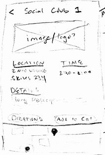
Wireframes - Mid-fid
Home

Search/Browse/Filter

Event Detail
Add to Cal

Search Results


Set a Reminder
User Testing
I had a few different students test the mid-fidelity prototypes created in Adobe XD for the process of finding, browsing, and viewing the details of events. Besides task testing, I also included tests like different cards shapes, search bar vs. icon, and different filters.
Task 1
Find a social event that interests you and add to your calendar
Task 2
After finding that event, set up a push notification to remind you of the event
User Testing Insights
While I only got to test with a few people, I still got valuable feedback that made me look at my designs differently. For the iteration results, most users prefer the rounded cards, filters coming down from the top, and keeping the search bar. Below are some other elements mentioned often:
- A way to know if the event is available in your schedule or not before you view the event
- Liked the home page with a mini calendar, but definitely necessary to have a full calendar section in the overall app
-
Confirmation after reminder AND after changing filter settings
-
More details when adding to calendar → wanted to see their own calendar before confirming
-
Social aspect: share event with friends, see what friends are attending each event
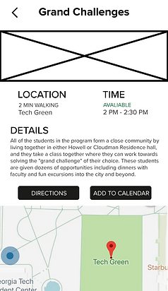
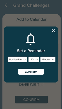
Final Mockup
High-fidelity mockups and flow of the final orientation events experience
Event Homepage

Search/Browse/Filter

Search Results

Detailed Event

Add to Calendar

Set Reminder
Confirmation

End Reflection
Throughout the entire process, I had a lot of fun and learned more about the entire design process and current design trends. I got too excited because I wanted to add a ton of different features, but I decided those were way beyond the scope of the project. Here are some future details I would of added on:
-
Full calendar/schedule feature
-
Notes input for every event
-
good icons
-
profile page or social profile
-
Designing the interaction and visuals for accessibility
Besides the time constraints, I had a few other predicaments along the way:
Information Architecture: the filters pushed me to discover what the most important filters were, and how current design patterns help me understand how they should be organized
Weighing Features: In the beginning, I started out too large and got away from the true goal of the project. User testing revealed what features exactly needed to be involved and what did not.